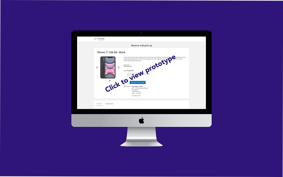
Reserve Online, Pickup Instore
Omnichannel feature
A way for small telecom retailers to obtain webspace away from their carriers to display products, and to allow their customers to reserve them ahead of an instore purchase.
ROLE
UX / UI Designer
COMPANY
IQmetrix
TYPE
Responsive web B2C SaaS
SHIPPED
Aug 2022 (6 month project)
RESPONSIBILITIES
-
User research
-
User experience
-
Wireframes
-
Visual Design
-
User testing
-
Documentation
TOOLS

Azure
DevOps

Miro
Zoom
Figma

Maze App
Confluence

Project Brief
Consumers using the ROPIS feature find the product they want through Google Pointy. They "Google Search" for the make and model of their choice and Pointy will return the best results at the top of the page in the "Ads" area. If the consumer has their location services turned on, the first choice will be from a brick and mortar store closest to them, else they can search the make, model and city to find something near them. If they find the store is closed or out of stock, this new feature will allow them to choose another location of the same company that suits their needs.
The Problem
Small telecom retailers typically have websites, however, any time a customer wants to buy a product that a retailer sells on their site, the customer is redirected to the carrier site instead, losing the sale for the small retailer.
Consumers need a way to get what they want, when and where they want as having to wait for shipping is frustrating.
The Solution
-
Provide an online gateway to the retailers instore inventory in a competitive way against large big box stores.
-
Provide an easy way for customers to locate the product they want and allow them to reserve/purchase at their preferred retailer.
-
Provide a way for customers to choose a store location of their choice.
Picking up where the
team left off
Late 2021, I returned back to work from a one year maternity leave. In the year I was away, the Design Team worked as a skeleton crew; we were mid pandemic, several staff had left the company and a hiring freeze was in place. The Designers that remained did a fabulous job to "keep the lights on" and began the research for ROPIS. My first project back was to finish where they left off so they could move on to the rest of their backlog.
What was already known and complete by the time the project was handed off to me:
-
Some journey mapping of the MVP
-
Basic level wireframes (that were already delivered to development to get a head start)
-
Google Pointy API was chosen by development to assist in our solution and to stay competitive in SEO.
My Process
-
Stakeholders workshop
-
Qualitative research
-
Competitive analysis
-
Creating the flow diagram
-
Iteration 1
-
Usability testing
-
Iteration 2
-
Delivery

Stakeholder Workshop
It is important to have the involvement of as many stakeholders as early as possible at the beginning of a project. It saves a lot of time having to pivot when new information is found too late in the project.
I held a workshop for the stakeholders in this feature using Miro. I included the PM, PO, Lead Engineer, other Designers and myself.
In this workshop, we:
-
Identified our assumptions
-
Reframed assumptions as “hypotheses”
-
Ranked them in order of importance and level of completeness
-
Determined the type of test to validate hypothesis IE: Qualitative or Quantitative
Stakeholders Workshop - Results
From the workshop exercise, we discovered there are medium sized telecom retailers that have multiple locations but only one website for them all. We realized that not only did we need to allow the customers to reserve/purchase on the retailer site, but that each location needed to be separated according to each locations' inventory. On top of that, each retail location needed to have the power to opt out of this feature as they are each individually owned.

Therefore when designing the change location feature, I needed to consider the fact that not all locations would be visible to the consumer. This may cause confusion if they know there is a location near them (because they may have seen it) and it is not listed in their choices.
Results cont.
We also found the original designs submitted to development needed updating. The current order of information, the content, hierarchy, and flow were quite clunky and the interface was not utilizing the design system.

The original layout
Quantitative Research - Validating Order of Information
To understand the journey users take to purchase a new phone (such as why they choose their preferred product or what about the retail locations better suited their needs), I chose to gather some quantitative responses from people that already own phones. I sent out a Miro board to several people I work with with a card sorting exercise to complete and send back. Understanding this journey will help me create the ideal order of the flow.
I created a list of all the attributes a purchase would have. IE: Phone specifications, the carrier, the location to pick up, deals, etc. I submitted to 5 people that have purchased a phone before and asked that they put the cards in order of importance to them.

Personas
I had two types of personas for this feature; one that is very tech savvy and one that is more traditional. Both in need of a phone for different reasons, but both prefer to buy from a brick and mortar store. A third anti-persona was also realized from testing the MVP: bots that will try to place reservations or steal personal data. We tackled that by utilizing Google reCAPTCHA


Competitive Analysis
To understand at what point in e-commerce flows "change location" patterns are found, I researched some e-commerce sites with a similar product to research. They were Amazon, Bestbuy, Canadian Tire and Walmart
Findings
-
Instore pickup - the change location process was located directly on the product page.
-
Shipping - the change location process was located in the check out flow.
-
Interaction types: Clicking the CTA link will allow you to select a preferred location, by either expanding the "change location" card or taking you to an entirely new screen or modal.

Competitive analysis screenshots
Flow Diagram
Once I created this user flow diagram, I found several unanswered questions, I needed to meet the team to discuss further.

Findings
Together with the team and my own research these questions were answered:
-
How many locations should we return?
No more than 25, I had looked into all of our clients that had multiple locations and none of them had over this number in a 50 km or 50 mile radius.
-
What is the maximum distance we should return a location?
After doing a competitive analysis, the typical return was 25 km in Canada or 25 miles in USA
-
Do we want to include a map visual for MVP?
Not at this time, Nielsen Norman Group has done research that proved no users complained a map wasn't there.
-
Do we need to offer directions to the store for MVP?
No, there are other routes the user could take if they really needed it.
-
Should we show store hours for MVP?
Yes, the user should not go to a location to find a store closed.
-
How long can we expect for location list to load
Include skeleton loading screen to be sure user knows something is happening either way
-
Can we utilize an API to autocomplete addresses in the search field?
Dev team to spike, but not required for MVP
Use Case Scenarios
Together with the results from above, I needed to find the ideal order of returned search results, this was my thought process to resolve that

Iteration 1
-
Began with original design that was completed by the previous designers
-
Redesigned and relocated "change location" feature
-
Updated the look of the Carousel component
-
Applied design system rules and components
-
Worked with legal regarding the details of Terms of Use and the placement in UI
-
Updated the wording to follow design system tone
-
Redesigned the form
-
Added reCAPTCHA
-
Created hi-fi prototype


Usability Test
Things discovered from this exercise:
-
All users changed the location from the product page rather than the optional reservation page
-
The location search pattern felt natural
-
The secondary buttons in the change location modal looked disabled
-
Testers were concerned about the price of the phone because they are used to applying the price into a contract/plan
-
The confirmation screen seemed an unfamiliar pattern


Iteration 2
-
Changed the secondary buttons to ghost buttons
-
The phone price and plans went into consideration to build for MVP
-
A "review before commit" page went into consideration to build for MVP
-
Added disclaimer for email address
-
Refined high-fidelity design & prototype


Design to Development Handoff
For handoff, I created a presentation for an all-hands meeting between the PM, PO, Dev Lead, and all Developers assigned to this project. It acts as a solid checkpoint on where we are on the project, to understand what to expect and for anyone to provide input/questions.

Annotated Figma File - Mobile, Tablet & Desktop versions
Pains
-
Entering a project later in the design cycle had its challenges with information transfer and having to repeat some work
-
The Design System we used for ROPIS was actually built for an older iQmetrix product, we tried to scale it out for this project, but we found the Design System needs many improvements before we can apply it appropriately.
-
I wanted to change the reservation confirmation page to a more familiar design pattern, which was to open a new page but since the development had already begun, it was too late to submit for MVP. My fear for this being done before customers begin using it is that they will distrust the process.
Gains
-
This project allowed me to see the growth of a product. To test the waters in the success of the MVP before putting in the time and effort of going the full way to a BOPIS feature was well thought out and a good plan in my opinion.
-
Having senior designers on the team before me allowed me to get off on the right foot and I learnt a lot about how they validated their assumptions and worked with the rest of the team.
Conclusion
-
ROPIS is currently live and in beta testing with several clients but minimal reservations have been made. We know that purchasing online rather than reserving online is far more beneficial to customers, however, ROPIS is a stepping stone and gateway to BOPIS (Buy online, pickup instore), and that will come in the coming iterations. We are eager to continue building BOPIS while ROPIS exists in the meantime.