Government Service Design
The redesign of a software that had been delivered to its recipient without the use of user experience practices or visual design
ROLE
User / Experience Design Rework
COMPANY
BC Utilities Commission (hypothetical proposition)
TYPE
Internal Software (MS Access)
SHIPPED
Apr 2017 (2 month project)
RESPONSIBILITIES
-
User Research
-
Workflow Design
-
Visual Design
-
Prototyping
-
Usability testing
TOOLS

Adobe XD

Illustrator

Photoshop

MS Access

MS Excel
The updated dashboard design
About
From 2009 to 2014 (7 years) I worked at the BC Utilities Commission in the Performance Monitoring, Contract and Compliance department as a Compliance Officer. I wrote up and managed contracts from bidding government contractors, processed invoices and payments for them and monitored monthly reports from energy suppliers. This was all done manually at the time and we utilized MS Excel to manage the process and track data. Working manually was a very time consuming job, so we decided to hire a software development company to create a software program to centralize and digitize the processes.
Having been in the department for so long, I was made the POC and manager of the project. In the two years we worked with the contractor, I provided as much information as I could in order for them to understand our processes and tasks. Fortunately what was delivered was a product that worked, unfortunately they did not use a Designer and what was given to us did not have a great experience. I made it my goal to improve that.
The Problem
A software development contractor had worked with the BCUC and shipped the final product, but it was confusing, inefficient, and aesthetically displeasing. The interface needed rework.
The Solution
-
Update software navigation
-
Utilize company branding
-
Rework user interface using recognizable user journey patterns
My Process
-
Understand the users and their tasks
-
Understand current information architecture and simplify
-
Navigation design
-
Wireframes & testing
-
Branding and hi-fi mockups
-
Prototype & delivery
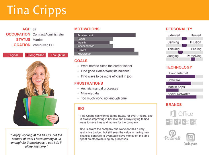
Personas
Several brainstorming meetings were conducted with all of the staff of the department (4 people) to determine what they would most benefit from with new department software. Each staff member ultimately came to one decision: Efficiency was key. They wanted an intuitive understanding and recognizable software patterns for each process. I interviewed each member separately and asked them what tasks they do on a day to day basis and how they accomplish them on the new software we had been given.
Information Architecture
I determined the overlap and duplicate data within the tasks staff had given me and from all data fields and forms. I was able to simplify the location of where to find this information and present it in a much simpler way.

Lo-fidelity Wireframes
Based on staff approved site architecture and navigation, below is the UI layout I came up with. I tested them with the department staff (in person and separately). I asked them several questions about where they would click to achieve certain tasks. Watching them allowed me to see that they found the navigation easy and they were able to achieve their tasks effortlessly. Aside from some minor changes, general feedback was that this was "way better than before!" and "this makes way more sense".

Branding & Hi-fi Mockup
Brand colours were already in place, it was just a matter of applying them. Utilizing the 60-30-10 colour rule, I applied the colours to the components.


Prototype
After finalizing the hi-fi mocks, I applied a prototype for clearer understanding during delivery.

Final

Pains
-
I left the BCUC to go to school for UX Design before the new interface was completed so I wasn't able to see it in action nor gather analytics or KPI's
-
This was my first experience with software design (before my education and work experience) and looking back now, there are several ways I would have done this project differently with the software development contractor to avoid the poor interface they shipped.
Gains
-
This was the project that made me realize that UX/UI Designer jobs existed. Having always been a creative logic type of person, I knew that was the job for me, and so I quit my finance job and went back to school.
-
I learnt so much about user journeys and now pay a lot of attention to all my own user journeys.